Apex
AI Personal Finance
Apex set out to make personal finance feel less like accounting and more like a quiet daily check-in. The app reads every transaction, tracks where the money goes and surfaces gentle, plain-language insight on top. The hard part was making that intelligence feel encouraging rather than judgmental.
The challenge
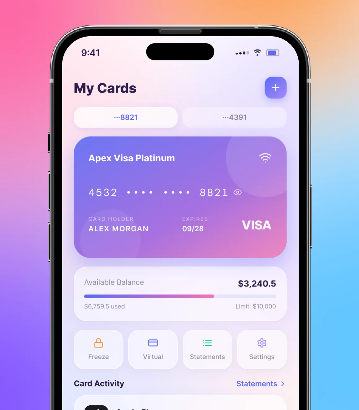
Most money apps either bury people in raw transactions or lecture them with red warnings and guilt, and neither actually helps anyone change. Apex needed to hold real financial depth, balance, income, expenses, categories and trends, while staying calm enough to open every morning. The AI had to feel like a supportive coach reading your week, not a system grading your choices.
The solution
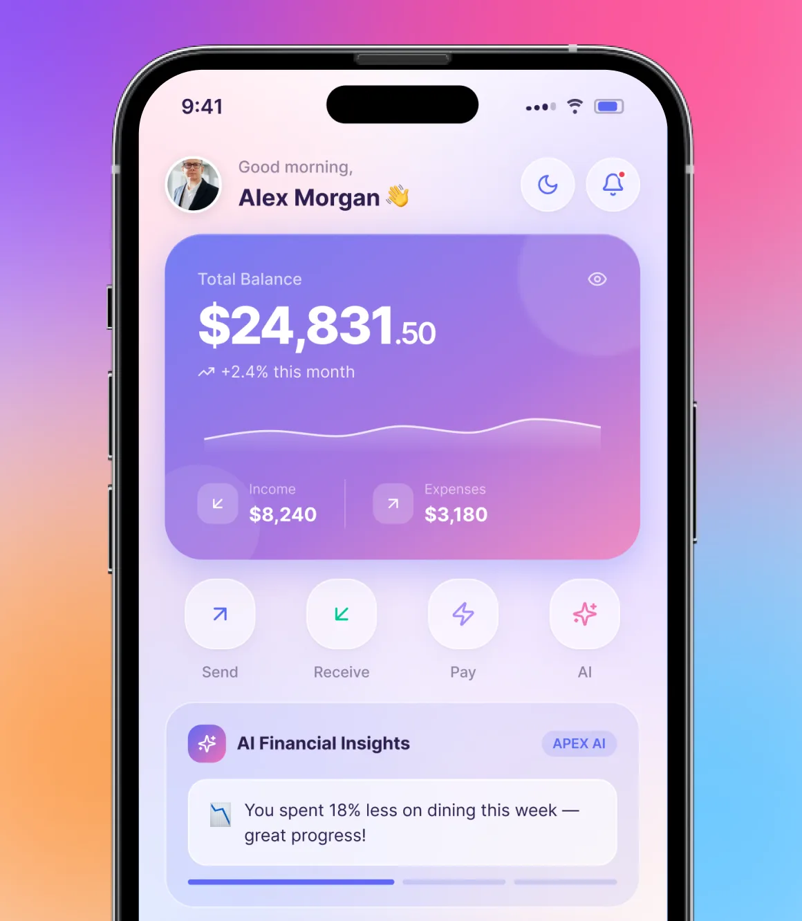
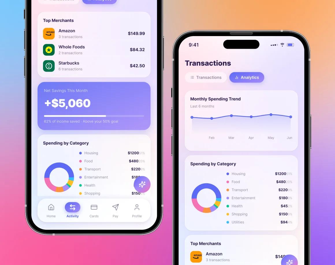
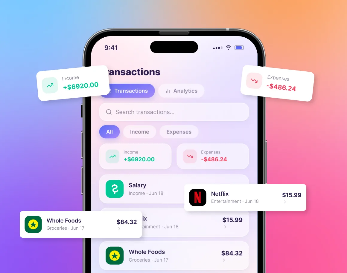
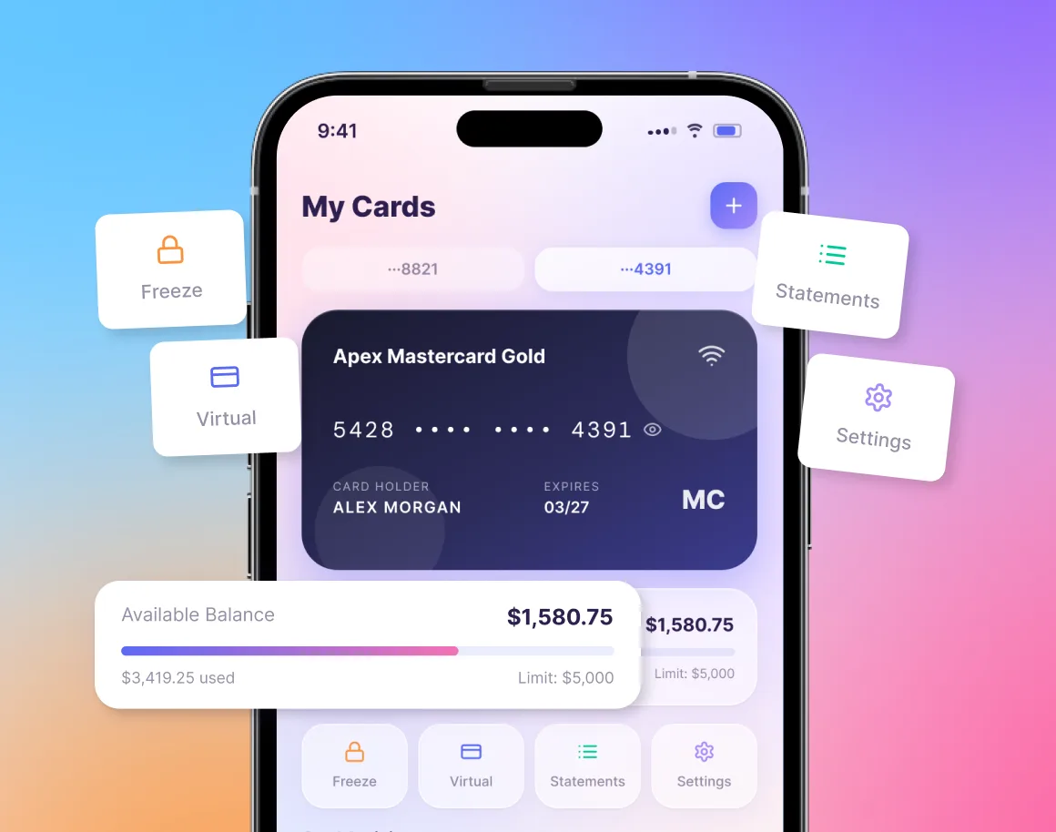
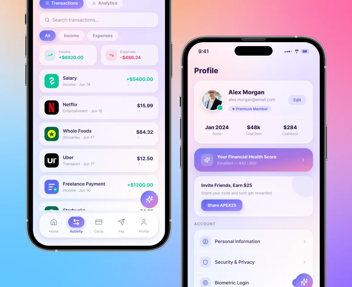
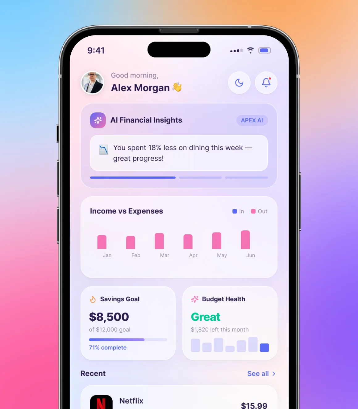
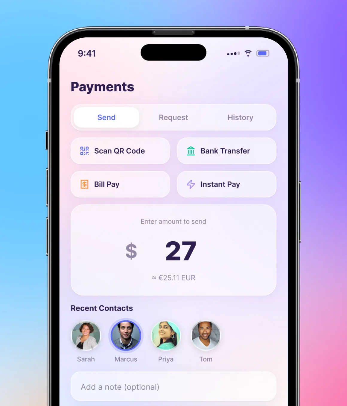
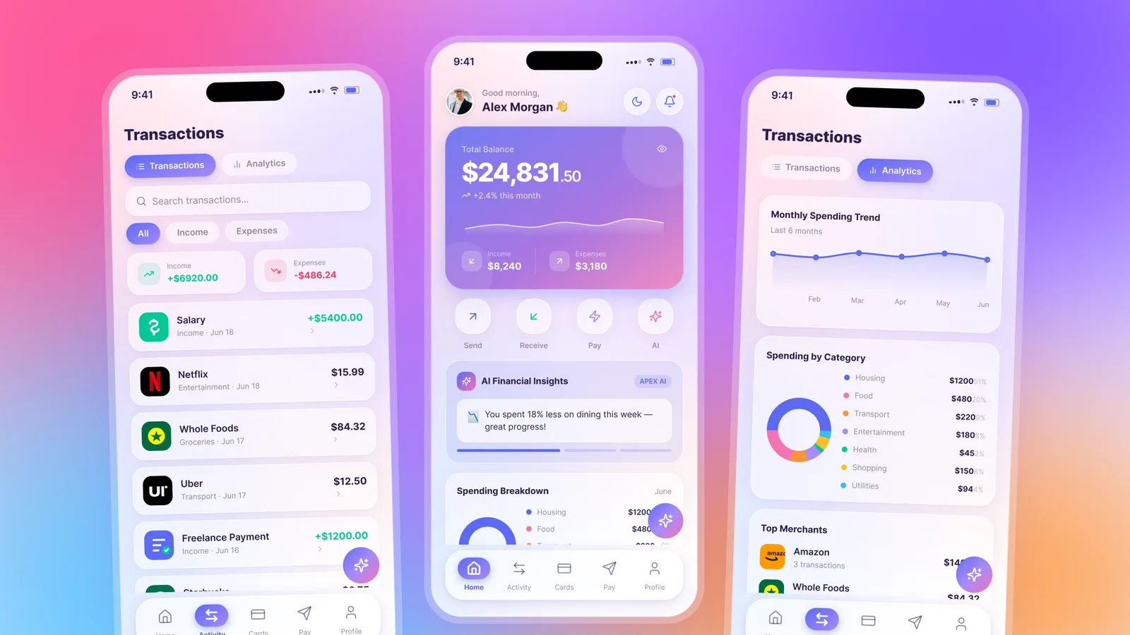
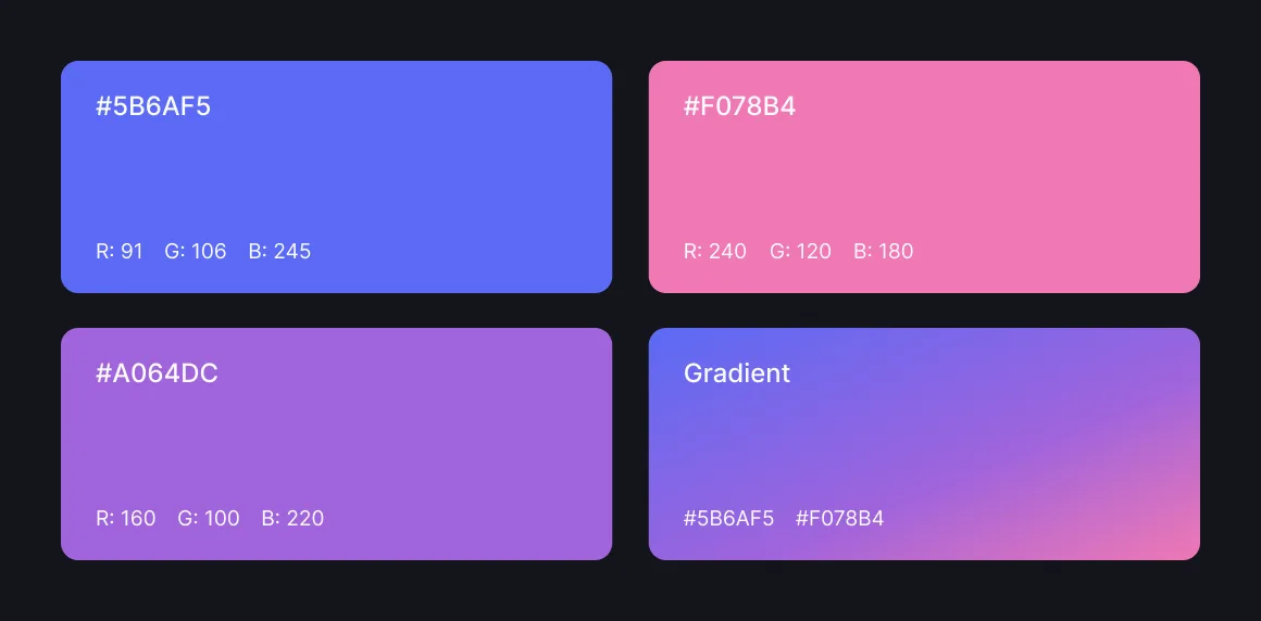
We designed the app around one glanceable truth: where you stand right now. The home screen leads with total balance, monthly change and quick actions to send, receive or pay, so the state of your money reads in a second. AI Financial Insights surface as friendly, specific notes tied to real behaviour, like spending 18% less on dining this week, framed as progress instead of penalty. Transactions, spending breakdown by category and monthly trends share one soft, gradient-led visual language, so moving from a quick check to a deeper review never feels like switching tools.


The results
Users started opening Apex out of curiosity rather than worry. Because the insights were specific and encouraging, people read them instead of dismissing the notifications, and the clear category breakdowns made overspending obvious without a single warning label. Apex launched as a finance app people actually want to check, and gave the team a product that feels as considered as the decisions it helps users make.